Visual & UX Designer — 16 days
Intro
Devour is a small Bay Area based culinary bookstore who strives to bring new and old culinary writings to their customers. The store mainly profits off the sale of books, magazines and menus. Staying engaged with their customers they hold special events with authors and chefs that people can attend for free and get their book signed.
Devour is looking to create a wholesome online shopping process that compliments the in store experience.
My process
The challenge
Create an e-commerce experience that targets people purchasing gifts and competes with big online retailers.
Constraints
Time and technical limitations of website manager who is responsible for maintaining the site.
Functional limitations with existing hosting site, Shopify.
Budget, redesign within limited funds of a small business.
Understanding the user
Gift Giver
Makes purchase decisions quickly
Buys gifts last minute
Is looking in specific price range and interests
Will possibly want gift options
Doesn’t have the time or care to read descriptions and reviews
Problem areas
No gift options
A lot of time spent browsing through products
Potentially high bounce rate
The target user is having a problem efficiently finding and buying gifts with the choice to add gift options. Therefore, the user is fleeing the site without finalizing their purchase.
Identifying friction points
Using competitor and comparator analysis to figure out what features other e-commerce sites have.
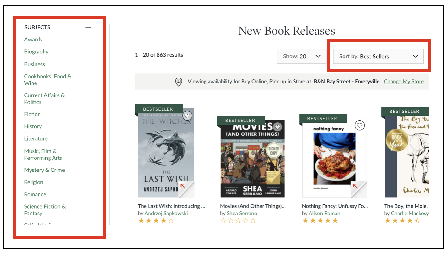
Taking a look at Devours’ competitors like Amazon Books and Barnes & Noble I saw how the sites’ online shopping experience could be improved. Both retailers use consistent features and options that guide the user through the process of purchasing a product. Also, they both make it very easy to find a wanted product when browsing on the website.
Barnes & Noble
Barnes & Noble
Amazon Books
Amazon Books
Barnes & Noble
Barnes & Noble
The solution: Add high impact, low effort features
Making an engaging online presence for users whose intentions are to buy meaningful gifts. I simply complemented their existing online content by creating an experience that makes it easier for the user to fulfill their task at hand.
I implemented a solution that will give the user the ability to have more control in their journey which is found to be key for user success. By using standard features that are consistently used on many big name e-commerce sites this will lead to consumer happiness.
Creating visibility by adding a popular items image carousel.
Making products easier to locate by adding sort & filter features on the products page.
The addition of gift options.
Early sketches
Testing initial wireframes
Using Sketch and InVision I created mid-fidelity wireframes to make an interactive prototype. This allowed my participants to focus on content and not design (color, font, etc.). Multiple rounds of usability testing was done to figure out any friction points within the new design. Each participant was asked to complete three tasks that involved the new features of the site.
From this testing I hoped to answer the following questions:
Are the users finding it quick and easy to locate wanted item?
Does the user understand the gift option process in checkout?
Are there any changes to be made to make the site more intuitive?
Landing page
Cart
Products page
Gift options in cart
Key findings from testing
Glows :
Participants reacted very positive towards the prototype. Most of them had success completing tasks and complimented the simple design.
Grows :
Original site information architecture was used in the prototype which created friction. Most participants found it confusing. Users didn’t like that the about was located on the landing page, they thought it should have its own tab.
The results: high-fidelity mockups
Image carousel
Display the stores most popular products on the homepage. This allows the customers who know nothing about the product the ability to quickly and easily buy a trendy gift.
Sort & Filter
A standard feature that allows the user to quickly and easily sift through many products in order to locate one.
Gift options
Gift options includes; gift receipt, gift wrap, and a personalized note. These options are consistent with features in large name companies.
Below is the pop up window that will appear over the shopping cart page when “Is it a gift?” link is selected.
Reflection & Next steps
This project allowed me to gain valuable experience in all stages of the UX process. From user and market research to visual design via high fidelity mockups. This project helped me to understand the importance of people and problem focused design, not feature focused. I also gained more experience creating a cohesive design under a tight pressure filled deadline that had many constraints.
Due to some time constraints I was only able to work on three specific journeys that the user would be taking. With more time I’d like to work on:
Usability testing on the information architecture to ensure it is completely intuitive.
Ideate and test different solutions.
Build out the checkout flow.
I would love to further discuss this project in person.
Contact information: (317) 332-5348 — ccbarth00@gmail.com


